Tuesday, September 9, 2008

Implementing a Breadth-First Search with LINQ

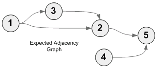
I was working on some code today that will manages the order of execution of some ETL jobs based on some known dependency information.  I've gathered the dependency information into a directed graph that I created using the QuickGraph library.  In order to prevent jobs from executing before their dependencies, I need to process the nodes (jobs) of the graph in a breadth-first manner.  For my unit test fixtures I have created the following directed graph:image

When I tried using the built-in breadth first search implementation, it visited the nodes in the following order 1, 3, 2, 5, and 4.  The problem is that it assumes a single root and does not look at the fact that 5 depends on 4, which hasn't run yet.  As I was digging around a bit with the .NET Reflector as to whether I should try implementing my own breadth-first search algorithm, I began thinking that there would probably be an easier solution possible with LINQ.  The highest number of vertices that I'm going to be dealing with at once is about 100, so performance really isn't much of a concern.

Note: I should mention that the vertices of the graph represent my jobs, which I originally was referring to as "Project Items".  In the code and comments below, these are all synonymous.  Eric Evans would disappointed in me for my lack of a ubiquitous language.

I started by initializing a Dictionary to track whether or not a particular job has been executed yet (starting with "false"):

// Initialize dictionary to track execution of all vertices
Dictionary<ProjectItem, bool> executedByProjectItem = graph.Vertices.ToDictionary(v => v, e => false);


Then I loop until they've all been executed:


// Keep looping while some jobs have not been executed
while (executedByProjectItem.Values.Any(e => !e))
{
	...
}


Inside the loop, the first thing I want to do is get a list of all the vertices (ProjectItems) that can currently be executed.  To get this list:


  1. I start with the graph's vertices and ...


  2. I perform a join to the edges...


  3.      ...where the vertex name matches the edge's target vertex's name. 


    The GroupJoin method provides a collection of edges for each vertex in my graph. 


  4. From that join, I create a new anonymous type that contains a reference to the vertex,


  5.      ...and then a count of the related edges for which the source job has yet to execute. 


  6. With that calculation in hand, I filter the list down to just those vertices that have no unexecuted dependencies


  7.      ...and have not already been executed themselves (root vertices would otherwise continue to be executed since they will always have an UnexecutedDependencyCount of  0). 


  8. In the final step, I use the Select projection method to create a return set of IEnumerable<ProjectItem> instead of the anonymous type, since that's what I'm really interested in.


image


The final step of the loop is to just iterate through all the jobs that can be executed, and uh... execute them.


When I ran this code, the output looked like this:


Executing job: projectItem1
Executing job: projectItem3
Executing job: projectItem4
=== Pass complete ====
Executing job: projectItem2
Executing job: projectItem5
=== Pass complete ====


There is a subtle issue at work here.  Based on my query, I should have only seen 1 and 4 in the first pass.  Job 3 should have been executed on the second pass, once Job 1 had been executed.  However, due to the nature of deferred execution of some operations in LINQ, once Job 1 has been marked as executed, Job 3 just showed up to the party late.  It's obviously not wrong, it was just a little unexpected the first time I saw it.  To get a static list on the first pass, I could add a call to the ToList() at #8 in the code listing above, which would have iterated through the collection immediately.  With the ToList call in place, the code produces the following output:


Executing job: projectItem1
Executing job: projectItem4
=== Pass complete ====
Executing job: projectItem3
=== Pass complete ====
Executing job: projectItem2
=== Pass complete ====
Executing job: projectItem5
=== Pass complete ====


It's interesting how the deferred execution actually cuts down on the number of times I have to iterate through the jobs to execute them all (from 4 to 2), and because the results will still be correct, I've gone without the ToList in my final copy of the code.


At the end of the day, I am happy with how that worked out.  In about 30 lines of code with LINQ, I was able to implement a reliable Breadth First iteration of my directed graph with potentially multiple root nodes.

Monday, April 21, 2008

How SharePoint 2007 Renders Its Content

In my previous post, I showed how to customize a list form without losing all the built-in SharePoint functionality. At the heart of my approach was harnessing SharePoint's own template rendering mechanism, the details of which I'm going to dive into now.

If you've ever used any of the template-based controls in ASP.NET (GridView, Repeater, DataList, etc.), then you've already touched on the core concept. For example, the Repeater control provides various templates (header, footer, item, alternating item, etc.) that allow you to control what content is rendered at different points during the rendering process. Typically you'll provide markup for the control on your page like so:


<asp:Repeater id="myRepeaterUL" runat="server">
  <HeaderTemplate>
    <ul>
  </HeaderTemplate>

  <ItemTemplate>
    <li>
      <a href='<%# DataBinder.Eval(Container.DataItem, "URL") %>'>
        <%# DataBinder.Eval(Container.DataItem, "Name") %>
      </a>
    </li>
  </ItemTemplate>

  <FooterTemplate>
    </ul>
  </FooterTemplate>
</asp:Repeater>

Each template you provide in the page markup is loaded by the ASP.NET runtime and exposed through the ITemplate interface which has a single method with the following signature:

void InstantiateIn(Control container)

With the templates loaded, all the Repeater control has to do to instantiate a new row of data is call this method passing in the appropriate container. New instances of any contained ASP.NET controls will be instantiated and processed through the usual ASP.NET control lifecycle.

Now switching back into the SharePoint world, if you look in the C:\Program Files\Common Files\Microsoft Shared\web server extensions\12\TEMPLATE\CONTROLTEMPLATES folder, you will see a number of user control files (*.ascx) most of which contain very standard looking user control content. However, the largest of these files (DefaultTemplates.ascx) is a bit different and since it is at the heart of SharePoint's template rendering mechanism, it is the one I am focusing on. If you open up the file you will see that it contains nothing but instances of the <SharePoint:RenderingTemplate> control. Each RenderingTemplate control instance has a unique ID and a single child <Template> element. When SharePoint starts up, it parses all files in this folder and makes all the templates it finds easily accessible through the static GetTemplateByName method of the SPControlTemplateManager class.

In my last post, I showed a web part that exposes a Template ID setting that is used as the basis for its rendering. Instead of overriding one of the web part rendering methods like Render or RenderControl, I am overriding the CreateChildControls method. I simply create an instance of SharePoint's TemplateContainer control, provide its template by loading the template specified in the web part's Template ID setting, add the TemplateContainer instance to my web part's Controls collection. ASP.NET does the rest. Here's the snippet of code I am referring to:


// Initialize template container with our custom template
templateContainer = new TemplateContainer();
templateContainer.Template = SPControlTemplateManager.GetTemplateByName(RenderingTemplateId);
...
// Add the container to the webpart control hierarchy
Controls.Add(templateContainer);

The custom template that I added to the CONTROLTEMPLATES folder to drive the rendering of my web part was derived from the ListForm template in DefaultTemplates.ascx which looks like this:

   1: <SharePoint:RenderingTemplate ID="ListForm" runat="server"&gt
   2:     <Template>
   3:         <SPAN id='part1'>
   4:             <SharePoint:InformationBar runat="server"/>
   5:             <wssuc:ToolBar CssClass="ms-formtoolbar" id="toolBarTbltop" RightButtonSeparator="&nbsp;" runat="server">
   6:                     <Template_RightButtons>
   7:                         <SharePoint:NextPageButton runat="server"/>
   8:                         <SharePoint:SaveButton runat="server"/>
   9:                         <SharePoint:GoBackButton runat="server"/>
  10:                     </Template_RightButtons>
  11:             </wssuc:ToolBar>
  12:             <SharePoint:FormToolBar runat="server"/>
  13:             <TABLE class="ms-formtable" style="margin-top: 8px;" border=0 cellpadding=0 cellspacing=0 width="100%">
  14:             <SharePoint:ChangeContentType runat="server"/>
  15:             <SharePoint:FolderFormFields runat="server"/>
  16:             <SharePoint:ListFieldIterator runat="server"/>
  17:             <SharePoint:ApprovalStatus runat="server"/>
  18:             <SharePoint:FormComponent TemplateName="AttachmentRows" runat="server"/>
  19:             </TABLE>
  20:             <table cellpadding=0 cellspacing=0 width="100%"><tr><td class="ms-formline"><IMG SRC="/_layouts/images/blank.gif" width=1 height=1 alt=""></td></tr></table>
  21:             <TABLE cellpadding=0 cellspacing=0 width="100%" style="padding-top: 7px"><tr><td width="100%">
  22:             <SharePoint:ItemHiddenVersion runat="server"/>
  23:             <SharePoint:ParentInformationField runat="server"/>
  24:             <SharePoint:InitContentType runat="server"/>
  25:             <wssuc:ToolBar CssClass="ms-formtoolbar" id="toolBarTbl" RightButtonSeparator="&nbsp;" runat="server">
  26:                     <Template_Buttons>
  27:                         <SharePoint:CreatedModifiedInfo runat="server"/>
  28:                     </Template_Buttons>
  29:                     <Template_RightButtons>
  30:                         <SharePoint:SaveButton runat="server"/>
  31:                         <SharePoint:GoBackButton runat="server"/>
  32:                     </Template_RightButtons>
  33:             </wssuc:ToolBar>
  34:             </td></tr></TABLE>
  35:         </SPAN>
  36:         <SharePoint:AttachmentUpload runat="server"/>
  37:     </Template>
  38: </SharePoint:RenderingTemplate>

There's a lot in that template that I could discuss, but the part I want to focus on is the ListFieldIterator on line 16 as this is where all the field rendering occurs.

Before we dive in, you first need to understand that the context under which the page is running in SharePoint is key in defining the behavior of the ListFieldIterator. When you reassign a particular page as the "Edit" form for a list, you'll notice that the URL in the browser carries this context to the page when it loads. For example, in my "Edit Test Center" page example from my first post, the URL that SharePoint uses to launch the edit page with context looks like this:

http://vm-mossdev/sites/intranet/Test%20Security/Pages/TestCenterEdit.aspx?ID=1&List=9a2e36fb-2f44-4355-a2c6-103a6376ac8b&Source=http%3a%2f%2fvm-mossdev%2fsites%2fintranet%2fTest+Security%2fLists%2fTest+Centers%2fAllItems.aspx

SharePoint uses the ID and List parameters to establish the context for the page, and exposes this via the SPContext class. This class has a plethora of information about the current SharePoint context including the list (SPList), the current item (SPItem), and the most importantly for our purposes now, the field definitions (SPField) for the underlying list.

Using this context, the ListFieldIterator iterates through the fields, creating new TemplateContainer controls and adding them to its Controls collection. Importantly, it assigns the FieldName and ControlMode properties. The FieldName is used later in the process by SharePoint to determine (based on the corresponding SPField instance) what kind of control should actually be rendered. The ControlMode property is used to indicate whether the control is in New, Edit or Display mode, which the ListFieldIterator assigns based on the value of its own ControlMode property.

Once it has created the TemplateContainer control, the template container needs a… you guessed it… template to contain. Since the ListFieldIterator class overrides the DefaultTemplateName property to return “ListFieldIterator”, this is the template that is loaded for each field. Looking in the DefaultTemplates.ascx file, this template looks like this:


<SharePoint:RenderingTemplate ID="ListFieldIterator" runat="server">
    <Template>
        <TR><SharePoint:CompositeField runat="server"/></TR>
    </Template>
</SharePoint:RenderingTemplate>


When this template is evaluated and constructed, the CompositeField control simply overrides DefaultTemplateName to first check whether the control mode is SPControlMode.Display and returns either “DisplayCompositeField” or “CompositeField”. The “CompositeField” template looks like this:


<SharePoint:RenderingTemplate ID="CompositeField" runat="server">
    <Template>
        <TD nowrap="true" valign="top" width="190px" class="ms-formlabel"><H3 class="ms-standardheader"><SharePoint:FieldLabel runat="server"/></H3></TD>
        <TD valign="top" class="ms-formbody" width="400px">
        <!-- FieldName="<SharePoint:FieldProperty PropertyName="Title" runat="server"/>"
             FieldInternalName="<SharePoint:FieldProperty PropertyName="InternalName" runat="server"/>"
             FieldType="SPField<SharePoint:FieldProperty PropertyName="Type" runat="server"/>"
          -->
            <SharePoint:FormField runat="server"/>
            <SharePoint:FieldDescription runat="server"/>
            <SharePoint:AppendOnlyHistory runat="server"/>
        </TD>
    </Template>
</SharePoint:RenderingTemplate>


What you will notice is that it contains markup and SharePoint controls for rendering both the label (<SharePoint:FieldLabel>) and the UI control that will be rendered to edit the underlying data (<SharePoint:FormField>). The CompositeField inherits from FieldMetadata which exposes a Field property which returns a reference to the SPField instance that is the basis for the current control’s rendering. However, there is nothing immediately obvious in the current context about how this control was created that defines this. If you remember back when the ListFieldIterator was iterating through the Fields collection, it set the FieldName property of each TemplateContainer controls it was creating. That TemplateContainer control is now the proud parent of our bouncing little CompositeField instance, and the FieldName property implementation of CompositeField climbs the control hierarchy to get the field name from the TemplateContainer which is then used by the Field property on the CompositeField control to return the appropriate SPField object based on the list currently in context. Is your head spinning yet?

When the FieldLabel control is created (which also inherits from FieldMetadata), it obtains the current SPField through the inherited Field property (which again in this case climbs the control hierarchy to the CompositeField, then to the TemplateContainer control as described above). Then depending on the ControlMode (whether for Display or not) and the field’s Required property in the list definition, it uses one of three templates: FieldLabelForDisplay, FieldLabelRequired, or FieldLabelDefault.

The most interesting of these three is the FieldLabelRequired template which includes the markup necessary for rendering the familiar little red asterisk next to the label. It looks like this:

<SharePoint:RenderingTemplate ID="FieldLabelRequired" runat="server">
    <Template>
        <nobr><SharePoint:FieldProperty PropertyName="Title" runat="server"/><span class="ms-formvalidation"> *</span></nobr>
    </Template>
</SharePoint:RenderingTemplate>

When the <SharePoint:FieldProperty> control is rendered by ASP.NET, it pulls the "Title" field value (as defined in the PropertyName attribute of the markup) from the current SPItem and renders it. (NOTE: If you look in the DefaultTemplates.ascx file you will see that the FieldProperty control is used quite frequently to render various properties of fields. You can see an example of this in the HTML comments generated by the CompositeField template above).

Let’s move back now to the second part of the CompositeField template that I want to highlight: the <SharePoint:FormField> control. In absence of an explicit template or template name, the FormField control uses its associated Field's FieldRenderingControl property to retrieve a template-based BaseFieldControl instance that is capable of rendering UI elements specifically for viewing or editing data for the current field type. It then adds this control to its Controls collection.

For an example, if the current field being rendered is a text field, the Field property will actually return an instance of an SPFieldText which inherits from SPField and overrides the FieldRenderingControl property to return an instance of the TextField template-based control. Since the TextField control overrides the DefaultTemplateName property to return "TextField", the following template is generally used (but not always, as in the case of "Choice" fields):


<SharePoint:RenderingTemplate ID="TextField" runat="server">
    <Template>
        <asp:TextBox ID="TextField" MaxLength="255" runat="server"/><br>
    </Template>
</SharePoint:RenderingTemplate>


So finally, when the FormField control is rendered, its child control (the TextField) is rendered, which results in the template listed above being processed and at the end of this very long chain of SharePoint infrastructure… out comes a plain old vanilla ASP.NET TextBox control. Phew!

Now I realize that this is an awful lot to take in, and this post is largely based on notes that I took for myself as I went and traced through all the logic so that I could understand what was going on under the covers. The upshot of it is that once you understand the rendering mechanism SharePoint uses, you can begin to customize your forms using custom templates in ways that used to require a complete departure from the out-of-the-box SharePoint functionality.

Wednesday, April 16, 2008

Customizing SharePoint 2007 Forms Without Losing Attachments (et al.) Functionality

I recently had some time on my hands, so I decided to explore different ways of customizing SharePoint forms in an effort to find the "best" way.  It seemed to me that to truly reap the benefits of using SharePoint as a development platform, the key was to reuse as much out-of-box functionality as possible (i.e. attachments, delete logic that is sensitive to the recycle bin's state, optimistic conflict detection on updates, etc).  However, once I started digging into the options for customizing forms, I was left wanting. 

First, I tried my hand at writing custom web parts and ended up with a lot of tedious coding (compared with the classic ASP.NET designer experience).  While I did wrap up some of the rendering logic into reusable base class methods to maintain the SharePoint look and feel, I was not satisfied with the experience and continued my search.

This led me to find Jan Tielens' excellent work on the SmartPart which is essentially a web part that hosts an ASP.NET user control.  It's great for enabling an ASP.NET designer experience, but doesn't really help accomplish the goal of reusing existing SharePoint functionality (additionally it has the drawback of making it a bit clumsy for users to configure your web parts themselves if that is applicable in your scenario).

At this point, my history in using code generation for data layers going back into the 90's came to the surface, and I briefly considered implementing code templates that would inspect the SharePoint list definitions and do all the initial gruntwork of setting up a page.  But then again, I'd be in the position of essentially reimplementing or figuring out how to integrate all the out-of-the-box SharePoint goodness described above.  Not the business I wanted to be in.

Still not satisfied I found some information on using SharePoint Designer to insert a custom list form, but I (and obviously a few others) found it to be problematic since it broke the functionality for attachments (or "attachements" if you ask the Microsoft developer who wrote the JavaScript).  Also, I was well outside of the world I wanted to be in for further customizations (some pretty heinous looking XSLT and JavaScript... yeech).

And so the little bird looked on...

image

I had recently become aware of the existence of all the templates in the the C:\Program Files\Common Files\Microsoft Shared\web server extensions\12\TEMPLATE\CONTROLTEMPLATES folder, and I decided that to stand the best chance of reusing SharePoint functionality, I needed to understand how SharePoint renders its own content.

So I rolled up my sleeves, whipped out my trusty .NET Reflector and went to work.  If there is interest, I will post a follow up on the details of my exploration through SharePoint's template rendering logic.

For the rest of you who just want to customize a form and retain attachments functionality, here's the skinny.

Solution

I have a list in my site that has some test data on Test Centers which I'll be using for this example.

image

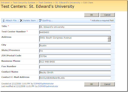
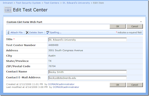
Below is a screen shot of the out-of-the-box Edit form which I want to customize.  For this example, let's assume that I want to make the Test Center Number and address components read-only, and I don't want either the phone or fax number to be displayed at all.  When I'm done, I want all the existing out-of-the-box SharePoint functionality to be preserved (Attach File, Delete Item, Spelling, optimistic Updates, created/modified by information, etc.).
image

When I put this solution together, I used Jan Tielens' Smart Templates for VS 2008 which made the process of building and deploying the web part an absolute breeze.  It creates a Setup folder that contains an installer (Setup.exe) which you'll need to run.

Once installed and deployed, activate it in the Site Collection Features page:

image

Before attempting to use the web part, you'll also need to install the CustomListForms.dll assembly (which should now be located in your web site's bin folder) into the GAC.  This can be done by dragging the file into the C:\Windows\assembly folder in Windows Explorer, or from a command prompt using the following command:

gacutil.exe /i "<assemblyFilePath>"

Next, add a new web part page to your site (I called mine "TestCenterEdit") and add an instance of the Custom List Form Web Part, which can be found in the "Custom List Forms" section.

image

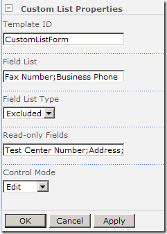
If you scroll all the way to the bottom in the properties pane on the right side of the page, you'll see the "Custom List Properties" section.  Expanding that shows the following settings (yours will be blank initially):
image

The Template ID identifies the ID of the template that SharePoint is going to use to render the web part (I'll show you how to add that template shortly).  The Field List allows you define the fields (as a semicolon delimited list) that you are targeting for inclusion/exclusion on the form based on the selection in Field List Type.  The Read-only Fields setting allows you to identify any fields that should be rendered for display only.  Finally, the Control Mode value tells SharePoint whether the controls should be rendered in New, Edit or Display mode.  Basically, this setting should match the function of the form you are customizing.  Since I'm customizing my Edit form, I've set mine to "Edit".  Once you've set the values the way you want them, click Apply.

The web part will still appear blank because we still need to provide the custom template that SharePoint will use to render our custom Edit form.  Create a new file called "CustomForms.ascx" in the C:\Program Files\Common Files\Microsoft Shared\web server extensions\12\TEMPLATE\CONTROLTEMPLATES folder.  SharePoint loads all the user control files in this folder when the application pool starts in IIS, enabling each "RenderingTemplate" to be referenced by ID.  Add the following markup to the new file:

<%@ Control Language="C#"   AutoEventWireup="false" %>
<%@Assembly Name="Microsoft.SharePoint, Version=12.0.0.0, Culture=neutral, PublicKeyToken=71e9bce111e9429c" %>
<%@Register TagPrefix="Custom" Assembly="CustomListForms, Version=1.0.0.0, Culture=neutral, PublicKeyToken=7597e2c2cd876846" namespace="CustomListForms" %>
<%@Register TagPrefix="SharePoint" Assembly="Microsoft.SharePoint, Version=12.0.0.0, Culture=neutral, PublicKeyToken=71e9bce111e9429c" namespace="Microsoft.SharePoint.WebControls"%>
<%@Register TagPrefix="SPHttpUtility" Assembly="Microsoft.SharePoint, Version=12.0.0.0, Culture=neutral, PublicKeyToken=71e9bce111e9429c" namespace="Microsoft.SharePoint.Utilities"%>
<%@ Register TagPrefix="wssuc" TagName="ToolBar" src="~/_controltemplates/ToolBar.ascx" %>
<%@ Register TagPrefix="wssuc" TagName="ToolBarButton" src="~/_controltemplates/ToolBarButton.ascx" %>
<SharePoint:RenderingTemplate ID="CustomListForm" runat="server">
<Template>
<SPAN id='part1'>
<wssuc:ToolBar CssClass="ms-formtoolbar" id="toolBarTbltop" RightButtonSeparator="&nbsp;" runat="server">
<Template_RightButtons>
<SharePoint:SaveButton runat="server"/>
<SharePoint:GoBackButton runat="server"/>
</Template_RightButtons>
</wssuc:ToolBar>
<SharePoint:FormToolBar runat="server"/>
<TABLE class="ms-formtable" style="margin-top: 8px;" border=0 cellpadding=0 cellspacing=0 width=100%>
<TR><SharePoint:CompositeField FieldName="Name" ControlMode="Display" runat="server"/></TR>
<Custom:CustomListFormFieldIterator runat="server"/>
<SharePoint:FormComponent TemplateName="AttachmentRows" runat="server"/>
</TABLE>
<table cellpadding=0 cellspacing=0 width=100%><tr><td class="ms-formline"><IMG SRC="/_layouts/images/blank.gif" width=1 height=1 alt=""></td></tr></table>
<TABLE cellpadding=0 cellspacing=0 width=100% style="padding-top: 7px"><tr><td width=100%>
<SharePoint:ItemHiddenVersion runat="server"/>
<wssuc:ToolBar CssClass="ms-formtoolbar" id="toolBarTbl" RightButtonSeparator="&nbsp;" runat="server">
<Template_Buttons>
<SharePoint:CreatedModifiedInfo runat="server"/>
</Template_Buttons>
<Template_RightButtons>
<SharePoint:SaveButton runat="server"/>
<SharePoint:GoBackButton runat="server"/>
</Template_RightButtons>
</wssuc:ToolBar>
</td></tr></TABLE>
</SPAN>
<SharePoint:AttachmentUpload runat="server"/>
</Template>
</SharePoint:RenderingTemplate>


If you're wondering how I came up with this template, open up the DefaultTemplates.ascx file  in the CONTROLTEMPLATES folder and search for the "UserListForm" template.  It's basically identical, except I switched out the <SharePoint:ListFieldIterator> element for my <Custom:CustomListFormFieldIterator>.  As an interesting learning exercise, search the file for all usages of the ListFieldIterator and see where else SharePoint uses this control.


Once the template is in place, restart IIS (or recycle the application pool) so that SharePoint will see the new template.  The last thing you need to do is associate your new web part page as the Edit form for your list.  The easiest way to do this is with SharePoint Designer (but could also be done through a feature):


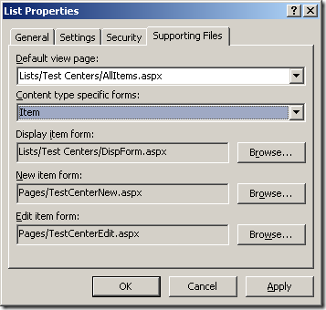
  1. Connect to your site in SharePoint Designer and expand the "Lists" node. 


  2. Right-click on the tree view item for your list and select "Properties".


  3. Click on the "Supporting Files" tab.


  4. Change the "Content type specific forms" to "Item".


  5. On the "Edit item form" setting, click the "Browse..." button and locate your web part page.


  6. Click OK to apply the changes.


Here is how my dialog looks after I've configured custom forms for the "New" and "Edit" functionality:


image


Go back to your web browser and navigate to the list and edit an item.  Voilà!


image


Attach File works!


image


Before saving...


image


After saving...


image


Delete works! (And it knows whether or not the Recycle Bin is enabled)


image


Optimistic updates work!


image


Spelling works!


(You get the idea)


The template I've given here should work for most needs, so the only work needed to customize additional forms is basically to add a new web part page, add the web part and change the properties appropriately, and configure the SharePoint list to use the new form for new/edit/display functionality.


If there is interest, and time allowing, I'll post a follow up going over the details of the web part implementation and explore other possibilities beyond just rendering the usual templated SharePoint controls (i.e. inserting a map immediately after the address).  You are, after all, operating within the ASP.NET infrastructure so a lot more customization is possible.


Get the source and Setup executable here.


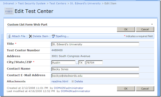
UPDATE: Based on a response I got on the TechNet thread on using SharePoint Designer for this, I added another property to the web part: FieldTemplateOverrides.  This allows you to specify a different template to use when rendering a particular field.  I changed my sample usage from above to exclude the State/Province and the ZIP/Postal Code columns, and then told the web part to use a different template for the "City" column (by setting the FieldTemplatesOverrides property to "City=CityStateZIPField".  Here's what the two templates that I added to my "CustomTemplates.ascx" file look like:


<SharePoint:RenderingTemplate ID="CityStateZIPField" runat="server">
<Template>
<TD nowrap="true" valign="top" width="190px" class="ms-formlabel">
<H3 class="ms-standardheader">
<nobr>City/State/ZIP<span class="ms-formvalidation"> *</span></nobr>
</H3>
</TD>
<TD valign="top" class="ms-formbody" width="400px">
<SharePoint:TextField runat="Server" FieldName="City" DisplaySize="15" TemplateName="TextFieldNoBr"/>, <SharePoint:TextField runat="Server" FieldName="State/Province" DisplaySize="2" TemplateName="TextFieldNoBr"/>
<SharePoint:TextField runat="Server" FieldName="ZIP/Postal Code" DisplaySize="10" TemplateName="TextFieldNoBr"/>
</TD>
</Template>
</SharePoint:RenderingTemplate>

<SharePoint:RenderingTemplate ID="TextFieldNoBr" runat="server">
<Template>
<asp:TextBox ID="TextField" MaxLength="255" runat="server"/>
</Template>
</SharePoint:RenderingTemplate>


I had to add a special template for the TextField because the out-of-the-box template appends a <br> tag at the end.  Here's how the web part renders now:


image


I didn't handle the "Display" or "Required" cases, but I could augment the property to take multiple templates for each (kind of like how Excel accepts various formats for positive and negative values), but at that point I should probably look to creating a custom UI so that it doesn't get overly convoluted to use...